Chapter 7: Custom Visualizations with D3.js
In this book we’ve looked at many different JavaScript libraries that were designed for specific types of visualizations. If you need a certain type visualization for your web page and there’s a library that can create it, using that library is often the quickest and easiest way to create your visualization. There are drawbacks to such libraries, however. They all make assumptions about how the visualization should look and act, and despite the configuration options they provide, you don’t have complete control over the results. Sometimes that’s not an acceptable trade-off.
In this chapter we’ll look at an entirely different approach to JavaScript visualizations, one that allows us to be creative and to retain complete control over the results. As you might expect, that approach isn’t always as easy as, for example, adding a charting library and feeding it data. Fortunately, there is a very powerful JavaScript library that can help: D3.js. D3.js doesn’t provide predefined visualizations such as charts, graphs, or maps. Instead, it’s a toolbox for data visualization, and it gives you the tools to create your own charts, graphs, maps, and more.
To see some of the powerful features of D3.js, we’ll take a whirlwind tour. This chapter’s examples include:
- Adapting a traditional chart type for particular data.
- Building a force-directed graph that responds to user interactions.
- Displaying map-based data using high-quality Scalable Vector Graphics.
- Creating a fully custom visualization.
Adapting a Traditional Chart Type
The most significant difference between D3.js and other JavaScript libraries is its philosophy. D3.js is not a tool for creating predefined types of charts and visualizations. Instead, it’s a library to help your create any visualization, including custom and unique presentations. It takes more effort to create a standard chart with D3.js, but by using it we’re not limited to standard charts. To get a sense of how D3.js works, we can create a custom chart that wouldn’t be possible with a typical charting library.
For this example, we’ll visualize one of the most important findings in modern physics—Hubble’s Law. According to that law, the universe is expanding, and as a result, the speed at which we perceive distant galaxies to be moving varies according to their distance from us. More precisely, Hubble’s Law proposes that the variation, or shift, in this speed is a linear function of distance. To visualize the law, we can chart the speed variation (known as red shift velocity) versus distance for several galaxies. If Hubble is right the chart should look like a line. For our data, we’ll use galaxies and clusters from Hubble’s original 1929 paper but updated with current values for distance and red shift velocities.
So far this task seems like a good match for a scatter plot. Distance could serve as the x-axis and velocity the y-axis. There’s a twist, though: physicists don’t actually know the distances or velocities that we want to chart, at least not exactly. The best they can do is estimate those values, and there is potential for error in both. But that’s no reason to abandon the effort. In fact, potential errors in the values might be an important aspect for us to highlight in our visualization. To do that, we won’t draw each value as a point. Rather, we’ll show it as a box, and the box dimensions will correspond to the potential errors in the value. This approach isn’t common for scatter plots, but D3.js can accommodate it with ease.
Step 1: Prepare the Data
Here is the data for our chart according to recent estimates.
| Nebulae/Cluster | Distance | Red Shift Velocity |
|---|---|---|
| NGC 6822 | 0.500±0.010 Mpc | 57±2 km/s |
| NGC 221 | 0.763±0.024 Mpc | 200±6 km/s |
| NGC 598 | 0.835±0.105 Mpc | 179±3 km/s |
| NGC 4736 | 4.900±0.400 Mpc | 308±1 km/s |
| NGC 5457 | 6.400±0.500 Mpc | 241±2 km/s |
| NGC 4258 | 7.000±0.500 Mpc | 448±3 km/s |
| NGC 5194 | 7.100±1.200 Mpc | 463±3 km/s |
| NGC 4826 | 7.400±0.610 Mpc | 408±4 km/s |
| NGC 3627 | 11.000±1.500 Mpc | 727±3 km/s |
| NGC 7331 | 12.200±1.000 Mpc | 816±1 km/s |
| NGC 4486 | 16.400±0.500 Mpc | 1307±7 km/s |
| NGC 4649 | 16.800±1.200 Mpc | 1117±6 km/s |
| NGC 4472 | 17.100±1.200 Mpc | 729±2 km/s |
We can represent that in JavaScript using the following array.
1 2 3 4 5 6 7 8 | |
Step 2: Set Up the Web Page
D3.js doesn’t depend on any other libraries, and it’s available on most content distribution networks. All we need to do is include it in the page (line 10). We’ll also want to set up a container for the visualization, so our markup includes a <div> with the id "container" on line 8.
1 2 3 4 5 6 7 8 9 10 11 12 13 | |
Step 3: Create a Stage for the Visualization
Unlike higher-level libraries, D3.js doesn’t draw the visualization on the page. We’ll have to do that ourselves. In exchange for the additional effort, though, we get the freedom to pick our own drawing technology. We could follow the same approach as most libraries in this book and use HTML5’s <canvas> element, or we could simply use native HTML. Now that we’ve seen it in action in chapter 6, however, it seems Scalable Vector Graphics (SVG) is the best approach for our chart. The root of our graph, therefore, will be an <svg> element, and we need to add that to the page. We can define its dimensions at the same time using attributes.
If we were using jQuery, we might do something like the following:
1 2 | |
With D3.js our code is very similar:
1 2 3 | |
With this statement we’re selecting the container, appending an <svg> element to it, and setting the attributes of that <svg> element. This statement highlights one important difference between D3.js and jQuery that often trips up developers starting out with D3.js. In jQuery the append() method returns the original selection so that you can continue operating on that selection. More specifically, $("#container").append(svg) returns $("#container").
With D3.js, on the other hand, append() returns a different selection, the newly appended element(s). So d3.select("#container").append("svg") doesn’t return the container selection but rather a selection of the new <svg> element. The attr() calls that follow, therefore, apply to the <svg> element and not the "#container".
Step 4: Control the Chart’s Dimensions
So far we haven’t specified the actual values for the chart’s height and width; we’ve only used height and width variables. Having the dimensions in variables will come in handy, and it will make it easy to incorporate margins in the visualization. The code below sets up those dimensions; its form is a common convention in D3.js visualizations.
1 2 3 | |
We’ll have to adjust the code that creates the main <svg> container to account for these margins.
1 2 3 | |
To make sure our chart honors the defined margins, we’ll construct it entirely within a child SVG group (<g>) element. The <g> element is just an arbitrary containing element in SVG, much like the <div> element for HTML. We can use D3.js to create the element and position it appropriately within the main <svg> element.
1 2 3 4 | |
Visualizations must often rescale the source data. In our case, we’ll need to rescale the data to fit within the chart dimensions. Instead of ranging from 0.5 to 17 Mpc, for example, galactic distance should be scaled between 0 and 920 pixels. Since this type of requirement is common for visualizations, D3.js has tools to help. Not surprisingly, they’re scale objects. We’ll create scales for both the x- and the y-dimensions.
As the code below indicates, both of our scales are linear. Linear transformations are pretty simple (and we really don’t need D3.js to manage them); however, D3.js supports other types of scales that can be quite complex. With D3.js using more sophisticated scaling is just as easy as using linear scales.
1 2 3 4 | |
We define both ranges as the desired limits for each scale. The x-scale ranges from 0 to the chart’s width, and the y-scale ranges from 0 to the chart’s height. Note, though, that we’ve reversed the normal order for the y-scale. That’s because SVG dimensions (just like HTML dimensions) place 0 at the top of the area. That convention is the opposite of the normal chart convention which places 0 at the bottom. To account for the reversal, we swap the values when defining the range.
At this point we’ve set the ranges for each scale, and those ranges define the desired output. We also have to specify the possible inputs to each scale, which D3.js calls the domain. Those inputs are the minimum and maximum values for the distance and velocity. We can use D3.js to extract the values directly from the data. Here’s how to get the minimum distance:
1 2 3 | |
We can’t simply find the minimum value in the data because we have to account for the distance error. As we can see above, D3.js accepts a function as a parameter to d3.min(), and that function can make the necessary adjustment. We can use the same approach for maximum values as well. Here’s the complete code for defining the domains of both scales:
1 2 3 4 5 6 7 8 9 10 11 12 13 14 15 16 17 18 | |
Step 5: Draw the Chart Framework
Axes are another common feature in visualizations, and D3.js has tools for those as well. To create the axes for our chart, we specify the appropriate scales and an orientation. As you can see from the code below, D3.js supports axes as part of its SVG utilities.
1 2 3 4 5 6 | |
After defining the axes, we can use D3.js to add the appropriate SVG elements to the page. We’ll contain each axis within its own <g> group. For the x-axis, we need to shift that group to the bottom of the chart.
1 2 | |
To create the SVG elements that make up the axis, we could call the xAxis object and pass it the containing group as a parameter.
1 | |
With D3.js, though, there’s a more concise expression that avoids creating unnecessary local variables and preserves method chaining.
1 2 3 | |
And as long as we’re preserving method chaining, we can take advantage of it to add yet another element to our chart: this time, it’s the label for the axis.
1 2 3 4 5 6 7 8 | |
If you look under the hood, you’ll find that D3.js has done quite a bit of work for us in creating the axis, its tick marks, and its labels. Here’s a taste of the SVG it builds.
1 2 3 4 5 6 7 8 9 10 11 12 13 | |
When we add the code for the y-axis, we’ve completed the framework for the chart.
1 2 3 4 5 6 7 8 9 10 11 12 13 14 15 16 17 | |
The result of figure isn’t very exciting without any data, but it does give us a framework for the chart.
As you can tell, we’ve had to write quite a bit of code just to get a couple of axes on the page. That’s the nature of D3.js. It’s not a library to which you can simply pass a data set and get a chart as an output. Instead, think of it as a collection of very useful utilities that you can use to help create your own charts.
Step 6: Add the Data to the Chart
Now that our chart’s framework is ready, we can add the actual data. Because we want to show both the distance and velocity errors in the data, we can draw each point as a rectangle. For a simple, static chart, we can add SVG <rect> elements just as we’ve created the rest of the chart. We can take advantage of our x- and y-scales to calculate the dimensions of the rectangles.
1 2 3 4 5 6 7 | |
The approach above works fine for this example and results in the chart of figure . Typically, however, D3.js visualizations combine their data sets directly with markup elements and rely on D3’s enter, update, and exit selections to add the data to the page. We’ll defer further discussion of this alternative approach until the next example.
Step 7: Answer Users’ Questions
Whenever you create a visualization, it’s a good idea to anticipate questions that users might ask when they view it. In our example so far, we’ve presented a data set that leads to Hubble’s Law. But we haven’t (yet) shown how well the data fits that law. Since that is such an obvious question, let’s answer it right on the chart itself.
The current estimate for the Hubble Constant (H0) is about 70 km/s/Mpc. To show how that matches the data on our chart, we can create a line graph with that slope beginning at the point (0,0). A single SVG <line> is all that’s required. Once again we rely on the D3.js scales to define the line’s coordinates.
1 2 3 4 5 | |
In figure we can see that Hubble’s Law remains a good approximation.
Creating a Force-Directed Network Graph
Unlike the JavaScript plotting libraries we considered in the early chapters, D3.js is not limited to standard charts. In fact, it excels at specialized and custom graph types. To see its power we’ll create another version of the network graph from Chapter 4. In the earlier implementation we used the sigmajs library, and most of our work was structuring the data into the format that library requires. We didn’t have to decide how to draw the nodes and edges, how to connect them, or, once we enabled layouts, how to position them on the page. As we’ll see below, D3.js doesn’t make those decisions for us. For this example, we’ll have to draw the nodes and edges, connect them to each other appropriately, and position them on the page. That may sound like a lot of work, but, as we’ll also see, D3.js gives us a lot of tools to help.
Step 1: Prepare the Data
Since we’re replicating the network graph from chapter 4, we start with the same data set.
1 2 3 4 5 6 7 8 9 10 11 12 13 14 15 16 17 18 19 20 | |
For the visualization it will be helpful to have two separate arrays, one for the graph’s nodes and a one for the graph’s edges. Extracting those arrays from the original data is straightforward, so we won’t bother looking at it in this chapter. You can, however, see the full implementation in the book’s source code. The result looks like the following:
1 2 3 4 5 6 7 8 9 10 11 12 13 14 15 16 17 18 19 20 21 22 23 24 25 26 27 | |
For the nodes, we’ve added x and y properties to define a position on the graph. Initially the code arbitrarily sets these values so that the nodes are positioned in a circle.
1 2 3 4 5 6 7 8 9 10 11 12 13 14 15 16 17 18 19 | |
The edges indicate the two nodes that they connect as indices in the nodes array and they include an array of the individual musicians that are common between the albums.
Step 2: Set Up the Page
As we noted in the previous example, D3.js doesn’t depend on any other libraries, and it’s available on most content distribution networks. All we need to do is include it in the page (line 10). We’ll also want to set up a container for the visualization, so our markup includes a <div> with the id "container" on line 8.
1 2 3 4 5 6 7 8 9 10 11 12 13 | |
Step 3: Create a Stage for the Visualization
This step is also the same as in the previous example. We ask D3.js to select the container element and then insert an <svg> element within it. In addition to appending the <svg> element, we can define its size by setting the height and width attributes.
1 2 3 | |
Step 4: Draw the Graph’s Nodes
We’ll draw each node as a circle by appending <circle> elements inside the <svg> stage. Based on the previous step, you might think that would be as simple as executing svg.append("circle") for each element in the nodes array.
1 2 3 | |
That code will indeed add 25 circles to the visualization. What it won’t do, though, is create any links between the data (nodes in the array) and the document (circle elements on the page). D3.js has another way to add the circles to the page that does create that linkage. In fact, not only will D3.js create the links, it will even manage them for us. This support becomes especially valuable as visualizations grow more complex.
Note: This feature is really the core of D3.js, and is, in fact, the source for the name “D3” which is shorthand for “Data Driven Documents.”
Here’s how we can use D3.js more effectively to add the <circle> elements to the graph.
1 2 3 4 | |
If you haven’t seen D3.js code before, that fragment surely looks very strange. What are we trying to do by selecting <circle> elements before we’ve even created any? Won’t the result just be empty? And if so, what’s the point of the data() function that follows? To answer those questions, we have to understand how D3.js differs from traditional JavaScript libraries like jQuery. In those libraries a selection represents elements of HTML markup. With jQuery, $("circle") is nothing more than the <circle> elements in the page. With D3.js, however, selections are more than just markup elements. D3.js selections can contain both markup and data.
D3.js puts markup elements and data objects together with the data() function. The object on which it operates (svg.selectAll("circle") above) supplies the elements, and its parameter (nodes above) provides the data. The first statement in the fragment, therefore, tells D3.js that we want to match <circle> elements with nodes in our graph. We are, in effect, saying that we want one <circle> to represent each value in the nodes array.
The result is easiest to understand when there are exactly as many elements as there are data values. Figure shows four <circle> elements and four albums. D3.js dutifully combines the two sets, giving us a selection of four objects. Each object has both a <circle> and an album.
In general, though, we can’t guarantee that there will be exactly as many elements as data values. Suppose, for example, only two <circle> elements existed for our four albums. As figure shows, D3.js still creates a selection of four objects, even though there aren’t enough circles for all of them. Two of the objects will have a data value but no element.
Our code fragment is an even more extreme example. When it executes, there are absolutely no circles on the page. There are, however, values in the nodes array that we’re telling D3.js to use as data. D3.js, therefore, creates an object for each of those data values. It just won’t have a <circle> element to go with them.
(Take a breath because magic is about to happen.)
Now we can look at the second statement in our code fragment. It starts with selection.enter(). The enter() function is a special D3.js function. It tells D3.js to search through the selection and find all of the objects that have a data value but no markup element. We then complete the statement by taking that subset of the selection and calling append("circle"). And with that function call, D3.js will take any object in the selection without a markup element and create a circle for it. That’s how we add <circle> elements to the graph.
To be a little more concise, we can combine our two statements into a single one. The effect, for our visualization is to create a <circle> within the <svg> container for every node in the graph.
1 2 3 | |
Step 5: Draw the Graph’s Edges
You won’t be surprised to find that adding the edges to the graph works just like adding nodes. We simply append <line> elements instead of circles.
1 2 3 | |
Note: Even though we won’t need to use them for this example, D3.js has other functions that complement the
enter()function. To find objects that have a markup element but no data value, you can use the functionexit(). And to find objects that have a markup element with a data value that has changed, you can use the functionupdate(). The names enter and exit derive from a theater metaphor that D3.js associates with a visualization. Theenter()subset represents those elements that are entering the stage, while theexit()subset represents elements leaving, or exiting, the stage.
Because we’re using SVG elements for both the nodes and the edges, we can use CSS rules to style them. That’s especially important for the edges because, by default, SVG lines have a stroke width of 0.
1 2 3 4 5 6 7 8 9 10 | |
Step 6: Position the Elements
At this point we’ve added the necessary markup elements to our visualization, but we haven’t given them any dimensions or positions. As noted before, D3.js doesn’t do any drawing, so we’ll have to write the code to do it. And as noted in step 2, we did assign somewhat arbitrary positions to the nodes by arranging them in a circle. For now, we can use that to position them.
To position an SVG circle we set its cx and cy attributes to correspond to the circle’s center. We also specify the circle’s radius with the r attribute. Let’s start with the radius; we’ll set it to a fixed value for all nodes. We’ve already created a D3.js selection for all of those nodes. Setting their r attributes is a simple statement:
1 | |
The cx and cy values are a little trickier because they’re not the same for all of the nodes. Those values depend on properties of the data associated with the nodes. More specifically, each element in the nodes array has x and y properties. D3.js, however, makes it very easy to access those properties. Instead of providing constant values for the attributes, we provide functions. D3.js will then call those functions and pass the data values as parameters. Our functions can return the appropriate value for the attribute.
1 2 3 4 | |
Positioning the edges relies on a similar strategy. We want to set the endpoints of the lines to the centers of the corresponding nodes. Those endpoints are the x1,y1 and x2,y2 attributes of the <line> elements. Here’s the code to set those attributes. As is conventional with D3.js, the parameter d is the data value.
1 2 3 4 5 | |
With the elements finally drawn and positioned, we have the first version of our visualization with figure .
Step 7: Add Force Direction to the Graph
The graph has all the essential components, but its layout doesn’t make identifying the connections as easy as we’d like. In chapter 4’s example the sigmajs library could automate the layout with only a couple of lines of JavaScript. To perform that automation, sigmajs uses a force-direction algorithm. Force direction treats nodes as physical objects and simulates the effect of forces such as gravity and electromagnetism.
With D3.js we cannot rely on the library to fully automate the layout. As we’ve seen, D3.js does not draw any of the graph elements, so it cannot, by itself, set positions and dimensions. D3.js does, however, provide a lot of tools to help us create our own graph layouts. One of those tools is the force layout. As you might expect, the force layout tool helps us draw our own force-directed graph. It handles all of the messy and complex calculations that underlie force direction and gives us results we can use directly in code that draws the graph.
To get started with the layout, we define a new force object. That object accepts many configuration parameters, but only five are essential for our visualization.
- the dimensions of the graph
- the nodes in the graph
- the edges in the graph
- the distance we’d like to see between connected nodes
- how strongly nodes repel each other, a parameter D3.js calls charge
The last parameter can take a bit of trial-and-error to optimize for any particular visualization. In our case we’ll want to increase it substantially above its default (-30) because we have a lot of nodes in a small space. (Negative charge values indicate repulsion.) Here’s the code to set all of those values.
1 2 3 4 5 6 | |
When we tell D3.js to start its force direction calculations, it will generate events at intermediate steps and when the calculations complete. Force direction often takes several seconds to execute fully, and if we wait until the calculations are complete before we draw the graph, users may think the browser has frozen. It’s usually better to update the graph at each iteration so users see some indication of progress. To do that, we can add a function to respond to the intermediate force layout calculations. That happens on a D3.js tick event.
1 2 3 | |
Each time D3.js calls our event handler function, it will have updated the x and y properties of the nodes array. The new values will reflect how the force direction has nudged the nodes on the graph’s stage. We can update our graph accordingly by changing the SVG attributes of the circles and lines. Before we do that, however, we can take advantage of the fact that D3.js is giving us an opportunity to tweak the force layout algorithm as it executes. One problem that we may encounter, especially with the large charge force we defined, is that nodes may repel each other so strongly that some tend to drift off the stage entirely. We can prevent that by ensuring that the node positions remain within the dimensions of the graph.
1 2 3 4 5 6 7 8 9 | |
We’ve added or subtracted 5 in the above fragment to account for the radius of the nodes’ circles.
Once we’ve adjusted the nodes’ properties to keep them on the stage, we can update their positions. The code is exactly the same as the code we used to position them initially.
1 2 3 | |
We’ll also want to adjust the endpoints of our edge lines. For these objects, however, there’s a small twist. When we initialized the edges array, we set the source and target properties to the indices of the respective nodes in the nodes array. When the D3.js force layout begins execution, it replaces those indices with direct references to the nodes themselves. That makes it a little easier for us to find the appropriate coordinates for the lines.
1 2 3 4 5 | |
With our function ready to handle updates from the force-direction calculations, we can tell D3.js to start its work. That’s a simple method of the force object.
1 | |
With that statement the graph begins an animated transition to its final, force-directed state as figure shows.
Step 8: Add Interactivity
Since D3.js is a JavaScript library, you would expect it to support interactions with the user. It does, and to demonstrate we can add a simple interaction to the graph. When a user clicks on one of the nodes in the graph, we can emphasize that node and its neighbors.
Event handlers in D3.js closely resemble those in other JavaScript libraries such as jQuery. We define an event handler using the on() method of a selection, as in the following code.
1 2 3 | |
The first parameter to on() is the event type, and the second parameter is a function that D3.js will call when the event occurs. The parameter to this function is the data object that corresponds to the selection element, and by convention it’s named d. Because we’re adding the event to the selection of nodes (nodeSelection), d will be one of the graph nodes.
For our visualization we’ll emphasize the clicked node by added a CSS-accessible class to the corresponding <circle> and by increasing the circle’s size. The class makes it possible to style the circle uniquely, but a circle’s size cannot be specified with CSS rules. Ultimately, therefore, we have to do two things to the circle: add the selected class and increase the radius using the r attribute. Of course, in order to do either we have to select the <circle> element. When D3.js calls an event handler, it sets this equal to the target of the event; we can turn that target into a selection with d3.select(this). The following code, therefore, is all it takes to change the clicked node’s circle.
1 2 3 | |
We can do something similar by adding a selected class to all the edges that connect to the clicked node. To find those edges we can iterate through the full edge selection. D3.js provides the each() function to do just that. As we look at each edge we check the source and target properties to see if either matches our clicked node. When we find a match, we add the selected class to the edge. Note that in line 3 we’re once again using d3.select(this). In this case the code is inside of the each() function, so this will equal the particular element of the current iteration. In our case that’s the <line> for the edge.
1 2 3 4 5 | |
That code handles setting the selected class, but we still need to remove it when appropriate. We can remove it from all the other circles (and make sure their radii are restored to its default value) by operating on the node selection. Other than line 2 below, the code looks the same as we’ve seen before. In line 2 we use the D3.js filter() function to limit the selection to the nodes other than the one that was clicked.
1 2 3 4 | |
A similar process resets the selected class on all the edges. We can remove the class from all edges first, before we add to the appropriate edges in the previous code fragment. Here’s the code that removes it. With D3.js it takes only a single line:
1 | |
And finally, if the user clicks on a node that’s already selected, we can restore it to it’s default state.
1 2 3 | |
When you put all of the above code fragments together, you have the complete event handler below.
1 2 3 4 5 6 7 8 9 10 11 12 13 14 15 16 17 18 19 20 21 22 23 24 25 26 | |
Along with a bit of CSS styling to emphasize the selected circles and lines, this code results in the interactive visualization of .
Step 9: Experiment with Other Enhancements
Our example has explored many of the features that D3.js provides for custom visualizations. The code so far, however, has only scratched the surface of D3’s capabilities. We haven’t added labels to our graph or animated the transitions in the graph’s state. In fact, it’s a pretty safe bet that if there is anything we want to add to the visualization, D3.js has tools to help. And although we don’t have the time or space to consider other enhancements here, the source code for the book does include a more full-featured implementation that takes advantage of other D3.js capabilities.
Creating a Scaleable Map
The first two examples touched on some of the capabilities of D3.js, but the library includes many others. From the examples in chapter 6, we know some of the best visualizations rely on maps, and D3.js—as a general-purpose visualization library—has extensive support for mapping. To illustrate that support, we’ll create a map that shows tornado sightings in the continental United States.
Step 1: Prepare the Data
The US National Oceanic and Atmospheric Administration publishes an extensive set of weather and climate data on its Climate Data Online site. That data includes all storm events reported in the [US and its territories. We can download the dataset for the year 2013 as a comma-separated-value (CSV) file. Because the file is extremely large and contains many events that aren’t tornadoes, we can edit it to remove the extraneous information using a spreadsheet application such as Microsoft Excel or Numbers for Mac. For this visualization, we only need records that have an event_type equal to ”Tornado”, and we only want the columns for the tornado’s latitude, longitude, and Enhanced Fujita Scale classification (a measure of tornado strength). Once we’ve pruned the (CSV) file appropriately, it will look something like the data below.
f_scale,latitude,longitude
EF1,33.87,-88.23
EF1,33.73,-87.9
EF0,33.93,-87.5
EF1,34.06,-87.37
EF1,34.21,-87.18
EF1,34.23,-87.11
EF1,31.54,-88.16
EF1,31.59,-88.06
EF1,31.62,-87.85
...
Since we’re going to access this data using JavaScript, you might be tempted to convert the file from CSV to JSON format. It’s better, however, to keep the data in a CSV file. D3.js has full support for CSV, so we don’t really gain anything by converting to JSON. More importantly, the JSON file would be more than four times larger than the CSV version, and that extra size would slow down the loading of our web page.
Step 2: Set Up the Page
Our skeletal web page is no different from the other D3.js examples. We set aside a container for the map (line 8) and include the D3.js library (line 10).
1 2 3 4 5 6 7 8 9 10 11 12 13 | |
Step 3: Create a Map Projection
If you can’t quite recall your geography lessons about map projections, don’t worry; D3.js can handle all of the heavy lifting. Not only does it have extensive support for common projections, but it also supports extensions for custom projections tailored specifically for visualizations. For example, there’s a modified Albers projection that’s optimized for choropleth maps of the United States. It repositions (and resizes) Alaska and Hawaii to provide a convenient map of all 50 states. In our case, since there were no tornado sightings in Alaska or Hawaii in 2013, we can use a standard Albers projection.
We set up the projection in the code below. First, in lines 1 and 2, we define the size our map in pixels. Then, in line 4, we create the Albers projection. D3.js supports many adjustments to the projection to position it appropriately on the page, but the default values are generally fine in our case. We only need to scale the map (line 5) and center it (line 6) on the page.
To draw the map on the page we’re going to use SVG <path> elements, but our map data takes the form of latitude and longitude values. D3.js has a path object to translate geographic coordinates to SVG paths based on a particular map projection. In lines 8 and 9 we create our path object.
1 2 3 4 5 6 7 8 9 | |
Step 4: Initialize the SVG container
Just as we’ve done in the previous D3.js example, we can create an SVG container to hold the map.
1 2 3 4 5 | |
As we’ll see in the later steps, it will be helpful have an inner group in which to place the map. This inner group (defined by a <g> element) acts much like an arbitrary <div> element in HTML. We create that inner group in line 5.
Step 5: Retrieve the Map Data
For our visualization, the map data is nothing but a map of the US with individual states. D3.js uses GeoJSON for its map data. Unlike most image tiles that we used in chapter 6, GeoJSON data is vector-based, so it can be used at any scale. GeoJSON data is also in JSON format, which makes it especially compatible with JavaScript.
Since our data is in a JSON format, we can use the d3.json() function to retrieve it. If you’re more familiar with jQuery, this function is almost identical to the jQuery $.getJSON() function.
1 2 3 | |
Step 6: Draw the Map
Once we have our data, we can draw the map on the page. The code in this step is very similar to that in the previous example. Each state will be a <path> element within the <g> container. Using the conventions of D3.js, we create a selection of <path> elements (line 1) and bind those elements to our data (line 2). When there is no element we create one (line 3), and we set its d attribute to be the path associated with the data, given our projection. Note that path in line 4 is the object we created in step 4. It is a function that translates the latitude and longitude information into appropriate SVG coordinates.
1 2 3 4 | |
As we can see from figure , D3.js gives us the paths required to create a nice SVG map.
Step 7: Retrieve the Weather Data
Now our map is ready for some data. We can retrieve the CSV file using another D3.js utility. Note, though, that all of the properties of a CSV file are considered text strings. We’ll want to convert those strings to numbers. We also want to filter out the few tornado sightings that don’t include latitude and longitude information.
1 2 3 4 5 6 7 8 9 10 11 12 13 14 | |
Once the browser has retrieved the CSV file from the server, we can begin processing it in line 2. Here we’re using the .filter() method of arrays to iterate through the data values. The .filter() method eliminates the data points without latitude and longitude values. It only returns true (line 10) if both values are present (line 3). While we’re checking the data points for latitude and longitude, we convert the string values into numbers (lines 4 and 5), extract the number from the Enhanced Fujita Scale classification (line 6), and calculate the position of the sighting in SVG coordinates using the projection function we created in step 3 (lines 7-9).
Step 8: Plot the Data
With the data retrieved, cleaned, and converted, it’s a simple matter to plot the points on the map. Once again we’ll use the traditional D3.js approach. Each data point is an SVG <circle> element, so we select those elements, bind the data to the selection, and use the .enter() function to create new <circle> elements to match the data.
1 2 3 4 5 6 | |
As you can see, we set the position of the circles using the position property we created in the previous step. Also, to indicate the relative strength of each tornado, we make the size of the circle proportional to the Enhanced Fujita Scale classification (line 6). The result in figure is a nice map of 2013 tornado sightings in the continental U.S.
Step 9: Add Interactivity
Maps naturally invite users to zoom in and pan around, and D3.js makes it easy to support those standard map interactions. Because D3.js gives us complete control, however, we’re not limited to conventions. Let’s do something a little different with our map. We can make it, so that clicking on any state zooms in on that state. Clicking a state that’s already zoomed in can then zoom the map back out to it’s default. As you’ll see, this behavior is easy to implement with D3.js.
The first bit of code we’ll add is a variable that keeps track of the particular state into which the map is zoomed. Initially, the user won’t have zoomed anywhere, so that variable is empty.
1 | |
Next we add an event handler to all of the state <path> elements. We can do that when we create the elements (which we did above in step 6).
1 2 3 4 5 | |
The extra statement is line 5. Like jQuery, D3.js gives us an easy way to add event handlers to HTML and SVG elements. Now we have to write that event handler. The handler needs to identify the state that the user clicked, calculate the position of that state (in SVG coordinates), and transition the map to zoom to those coordinates. Before we look at the implementation in detail, it’s worth noting that D3.js event handlers are optimized to work with data visualizations (which shouldn’t be surprising). In particular, the parameter passed to the handler is the data item associated with the target element (conventionally named d). The JavaScript context (this) is set to the specific element that received the event. If the handler needs access to the other properties of the JavaScript event, they’re available in the d3.event global variable. Here’s how those conventions work in a real event handler.
1 2 3 4 5 6 7 8 9 10 11 12 13 14 15 16 17 18 19 20 21 | |
In lines 2-4 we manipulate the map colors. The previously zoomed state is reset to a muted gray, and the clicked state is filled with a vibrant orange. Notice that this same code resets the active variable so that it accurately tracks the zoomed state. Next, in lines 6-14, we calculate the bounds of the zoomed state. Or rather, we let D3.js do the calculation. All the work happens in the bounds() function we call in line 6. The other lines are mostly just extracting the individual parts of that calculation. In line 11 we calculate how to scale the map so that the zoomed state fills 90% of the map. Then, in lines 12-14, we calculate how to shift the map to center that state. The final block of code (lines 16-20) adjusts the map by scaling and translating the SVG. As you can see from line 16, we’re using a D3.js transition to animate the change in view.
The code we’ve seen so far still needs a few minor additions to deal with some loose ends, but I’ll leave those to the book’s source code. The result in figure is a nice, interactive map of our data.
Creating a Unique Visualization
If you’ve followed the first three examples in this chapter, you’re probably beginning to appreciate the level of flexibility D3.js has compared to traditional JavaScript libraries. Instead of creating visualizations for you, it provides many tools and utilities that you can use however you wish. We’ve used that flexibility to add unconventional error bars to a chart, to refine the behavior of a network graph, and to customize user interactions with a map. With D3.js, however, we aren’t limited to minor adjustments to existing visualization types. Instead, we can use the library to create unique visualizations that are nothing like those in traditional libraries.
In this example we’ll use the same data we used previously—tornado sightings in the US.js from 2013. Rather than placing the sightings on a map, however, we’ll create an interactive, hierarchical visualization that lets users understand the number of sightings by region, by state, or even by counties within a state. A circular hierarchy can be especially effective for this subject, so we’ll create a sunburst visualization with rotational animations. The code that follows is based on an example developed by Mike Bostock, the lead D3.js developer.
Note: It is also possible to create sunburst visualizations using some charting libraries, generally by customizing a variation of the pie chart. Those libraries, however, are focused much more on off-the-shelf use. Creating custom visualizations is generally much easier with a library like D3.js which is designed especially for customization.
Step 1: Prepare the Data
For this example we’ll use the same data behind the previous visualization—2013 tornado sightings from the US National Oceanic and Atmospheric Administration’s Climate Data Online site. As before, we’ll clean and prune the dataset. Instead of longitude, latitude, and Enhanced Fujita Scale classification, however, we’ll keep the state and county. We’ll also add a region name as a way to group subsets of states. The resulting (CSV) file begins as below.
state,region,county
Connecticut,New England,Fairfield County
Connecticut,New England,Hartford County
Connecticut,New England,Hartford County
Connecticut,New England,Tolland County
Maine,New England,Somerset County
Maine,New England,Washington County
Maine,New England,Piscataquis County
...
Step 2: Set Up the Page
Our skeletal web page is no different from the other D3.js examples. We set aside a container for the visualization (line 8) and include the D3.js library (line 10).
1 2 3 4 5 6 7 8 9 10 11 12 13 | |
Step 3: Create a Stage for the Visualization
As with our other D3.js examples, we start by creating an <svg> container for the visualization. Within that container, we’ll also add a group (<g>) element.
1 2 3 4 5 6 7 8 9 10 11 12 | |
The code above contains a couple of new wrinkles. First, in line 3, we calculate the maximum radius for the visualization. This value—which is half of the height or the width, whichever is smaller—will come in handy in the code that follows. More interestingly, in lines 10-12 we translate the inner <g> container so that its coordinate system places the point (0,0) right in the center of the visualization. This translation makes it easy to center the sunburst and calculate sunburst parameters.
Step 4: Create Scales
When it’s complete, our visualization will consist of areas corresponding to regions in the U.S.; larger areas will represent regions with more tornadoes. Because we’re dealing with areas, we’ll need two dimensions for each region. We are not, however, going to draw our areas as simple rectangles; instead we’re going to use arcs. That will require a bit of trigonometry, but fortunately, D3.js provides a lot of help. We’ll start by defining some scale objects. We first saw scales in the step 4 of this chapter’s first example where they translated data values to SVG coordinates. The scales in the code below do much the same, except they’re using polar coordinates.
1 2 3 4 | |
As you can see, the angular scale is a linear scale that ranges from 0 to 2π (or 360°). The radial scale ranges from 0 to the maximum radius, but it’s not linear. Instead, this scale is a square root scale; D3.js takes the square root of the input before computing the output. The area of an arc varies as the square of its radius, and the square root scale compensates for this effect.
Note: In prior examples, we’ve set both ranges (outputs) and domains (inputs) for our scales. In this case, however, we won’t need to set domains explicitly. The default domain of [0,1] is exactly what we need for both scales.
The scales we’ve defined come in handy in the next bit of code, where we define a function that calculates the SVG path for a single arc. Most of the work takes place in the D3.js function d3.svg.arc(), which computes an arc’s path. That function, though, needs four parameters: the starting and ending angles and the starting and ending radii for the arc. The values for those parameters come from our scales.
When we use our arc() function later in the code, we’re going to call it with a D3.js selection. That selection will have a data value associated with it, and the data value will include four properties:
.x: the starting x–position for the data.dx: the data’s length along the x–axis (∆x).y: the starting y–position for the data.dx: the data’s length along the y–axis (∆y)
Given those properties, here’s the code that generates the arc path.
1 2 3 4 5 6 7 8 9 10 11 12 13 | |
The code itself is pretty straightforward, but a picture helps explain why we’re using the code this way. Assume that the data associated with a selection has a position (x,y) of (12.5, 10), a width of 25, and a height of 30. The data properties would then be:
.x = 12.5.dx = 25.y = 10.dy = 30
With Cartesian coordinates, we could draw the selection as on the left side of figure . Our scales and arc function will transform the rectangle to the arc shown on the right side of the figure.
We haven’t specified the ranges of the x– and y–scales, but assume for now that each ranges from 0 to 100. The starting x–value of 12.5, therefore, is 12.5% of the full range. When we convert that value to polar coordinates, the result will be 12.5% of the full 360°. That’s 45° or π/4. The x-value extends another 25%, so the final x–value adds another 90° or π/2 to the starting value. For the y–values, our scales take the square root and map the results to the domain from 0 to 250 (maxRadius). The initial value of 10, therefore is divided by 100 (for the range) and transformed to √0.1 ⨉ 250 or 79. The final value of 10 + 30 results in a radius of √0.4 ⨉ 250 or 158. That’s the process that creates an SVG for each data value.
Step 5: Retrieve the Data
With the initial preparation complete, we’re now ready to process the data. As in the previous example, we’ll use d3.csv() to retrieve the CSV file from the server.
1 2 3 | |
When D3.js retrieves the file, it creates a data structure that begins like the following fragment.
[ {
    "state":"Connecticut",
    "region":"New England",
    "county":"Fairfield County"
  },{
    "state":"Connecticut",
    "region":"New England",
    "county":"Hartford County"
  },{
    "state":"Connecticut",
    "region":"New England",
    "county":"Hartford County"
  },
...
That data structure reflects the data, but it doesn’t include the .x, .dx, .y, and .dy properties that we need to draw the arcs. There’s additional work to be done to calculate those values. If you recall the second example in this chapter, we’ve seen this situation before. We have a set of raw data, but we need to augment that raw data with additional properties for the visualization. In the earlier example, we used the D3.js force layout to calculate the extra properties. In this case we can use the partition layout.
Before we can use the partition layout, however, we have to restructure our data. The partition layout works with hierarchical data, and right now all we have is a single dimensional array. We must structure the data to reflect the natural hierarchy of region, state, and county. Here again, however, D3.js is able to help us. The d3.nest() operator analyzes an array of data and extracts the hierarchy from it. If you’re familiar with database commands, it’s the D3.js equivalent of the GROUP BY operation. We can use the operator to create a new version of the data.
1 2 3 4 5 6 7 8 9 10 11 | |
In line 1 we define the variable that will hold our restructured data. It’s an object with two properties. The .key property is set equal to "United States" and the .values property is the result of the the d3.nest() operation. In lines 4-6 we tell the operator to group the data, first by .region, then by .state, and finally by .county. Then, in lines 7-9 we tell the operator to set the final value to be simply the count of entries for the final grouping. Line 10 is where we pass the original dataset to the operator. When this statement finishes, the hierarchy variable contains a structured version of our data that begins like the following fragment.
{
    "key": "United States",
    "values": [
        {
            "key": "New England",
            "values": [
                {
                   "key": "Connecticut",
                   "values": [
                        {
                            "key": "Fairfield County",
                            "values": 1
                        },{
                            "key": "Hartford County",
                            "values": 2
                        },{
...
This structure matches what the partition layout needs, but there’s still one more step we need to take. The d3.nest() operator places both child arrays and leaf data in the .values property. By default, however, the partition layout expects the data to use different property names for each type of property. More specifically, it expects child nodes to be stored in the .children property and data values in the .value property. Since the d3.nest() operator does’t create exactly that structure, we have to extend the default partition layout. Here’s the code to do that.
1 2 3 4 5 6 7 | |
In lines 2-4 we provide a custom function to return a node’s children. If the node’s .values property is an array, then that property contains the children. Otherwise the node has no children and we return null. In lines 5-7 we provide a custom function to return a node’s value. Since this function is only used when no children exist, the .values property has to contain the node value.
Step 6: Draw the Visualization
It’s taken a bit of work to get to this point, but now we’re ready to draw the visualization. Here’s where we see the payoff for all the work. It only takes a few lines of code to create the visualization.
1 2 3 4 | |
This code follows the same structure we’ve used for all of our D3.js examples. In line 1 we create a selection of the SVG elements that represent our data; in this case we’re using <path> elements. We then bind the selection to the hierarchical data using the custom partition layout. In line 3 we identify the data values that don’t (yet) have an associated SVG element, and in line 4 we create new elements for those values. That final step relies on the .arc() function that we created in step 4. We haven’t yet added any colors or labels, but we can see from figure that we’re on the right track.
Step 7: Color the Areas
Now we can turn our attention to coloring the visualization. We want to give each region a unique, dominant color and then shade that color for states and counties within the region. A good starting point for us is a different type of D3.js scale, a categorical scale for colors. All of the scales we’ve seen so far are cardinal scales. They work with numerical values, and they map those numerical values to properties for the visualization. Categorical scales work with data values that are not numerical; rather, the values simply represent different categories of some quantity. In our case the regions represent categorical data. After all, there isn’t anything intrinsically numerical about New England, or the Southwest.
As you would expect from the name, a categorical color scale maps different category values into different colors. D3.js includes several of these predefined color scales. Since we have less than 10 different regions in our data, the d3.scale.category10() scale works fine for this example. Figure shows the different colors in this scale.
Our next task is assigning colors from this scale to the arcs in our visualization. To do that we’ll define our own color() function. That function will accept a data node from the partition layout as input.
1 2 3 4 5 6 7 8 | |
The thing we do in the function (line 2) is create a local variable that we’ll use to store colors. We then check to see if the input node is the root of the hierarchy. If it is, then we create a color scale (line 4) for the node’s children and assign the node its own color (line 5). The root node in our visualization, which represents the entire U.S., will be white. That assigned color will eventually be returned by the function.
After we create a color scale for the child nodes we want to distribute the individual colors to those nodes. There’s a slight catch, though. The nodes in the d.children array aren’t necessarily distributed in the clockwise order we want for our visualization. To make sure the colors from our scale are distributed in order, so we’ll have to sort the d.children array first. Here’s the complete code for this step.
1 2 3 4 5 6 7 8 9 | |
In the first line we make sure that there is a children array. If there is, then, in lines 2 and 3 we create a copy of the children array that contains just the node values and their original array index. Then, in lines 4 and 5 we sort that copy based on the node values. Finally, in lines 6 and 7 we iterate through the sorted array and assign colors to the child nodes.
So far we’ve created a categorical color scale and assigned its colors to the first-level children. That takes care of colors for the regions, but there are also states and counties that need colors. For those, we can create a different scale based on the parent color. Let’s go back to our function definition and add an else clause for non-root nodes. In that clause, we also create a color scale for the children. These child nodes, however, are not regions; they are states or counties. For states of a region and counties of a state, we don’t want unique, distinct colors like those from a categorical scale. Instead, we want colors related to the color of the parent. That calls for a linear gradient.
1 2 3 4 5 6 7 8 9 10 11 12 13 14 15 16 17 18 19 20 21 22 | |
In lines 7-10 we define the starting and ending colors for our gradient. To create those colors, we start with the parent node’s color (d.color) and darken or brighten it. In both cases we use hue, chroma, and luminance (HCL) as the basis for the color manipulations. The HCL color space is based on human visual perception, unlike the purely mathematical basis for the more familiar RGB color space. Using HCL general results in a more visually pleasing gradient.
Lines 12-18 contain the code to actually create the gradient. Here we’re using a D3.js linear scale (line 12) and a built-in interpolation algorithm for HCL colors (line 13). Our gradient ranges between the start and end colors (lines 14-17) and its domain is the indices of the node’s children (line 18).
Now all we need do is assign the appropriate color when we create each data value’s <path> element. That requires a one-line addition (line 5) to the code that creates those paths.
1 2 3 4 5 | |
As figure shows, our visualization now includes appropriate colors.
Step 8: Make the Visualization Interactive
To conclude this example we can add some interactivity. When a user clicks on an area in the chart, we can zoom the chart to show more detail for that area. To emphasize the subject matter, we’ll create a custom, rotating animation effect for this zoom. The easiest part of this step is adding the function to handle click events. We can do that when we add the <path> elements to the page.
1 2 3 4 5 6 | |
The function handleClick that line 6 references is, of course, the event handler that we’ll have to write. Conceptually, the function is pretty straightforward. When the user clicks on an area, we want to modify all the paths to make that area the focal point of the visualization. The complete function is as simple as the following code.
1 2 3 4 | |
The function’s single parameter is the data value corresponding to the clicked element. Conventionally, D3.js uses d for that value; in this case, however, we’re using datum to avoid confusion with the SVG "d" attribute. The first line in the function references all of the paths in the visualization and sets up an animated transition for those paths. The next line tells D3.js what values we’re going to transition. In this case we’re changing an attribute of the <path> elements (so we use the function attrTween) and the specific attribute we’re changing is the "d" attribute (the first parameter to that function). The second parameter, arcTween(datum) is a function that returns a function.
Here’s the complete implementation of arcTween().
1 2 3 4 5 6 7 8 9 10 11 12 13 14 15 16 17 18 19 20 | |
You can see that this code block defines several different functions. First, there’s arcTween(). It returns another function calculateNewPath(), and that function returns either interpolatePathForRoot() or interpolatePathForNonRoot(). Before we look at the details of the implementation, we want to be sure and understand the distinction between these functions.
arcTween()is called once (for a single click) in the click event handler. Its input parameter is the data value corresponding to the clicked element.calculateNewPath()is then called once for every path element, a total of 702 times for each click. Its input parameters are the data value and index of the path element.interpolatePathForRoot()orinterpolatePathForNonRoot()are called multiple times for each path element. Every call provides the input parametert(for time) that represents the amount of progress in the current animation transition. The time parameter ranges from 0 when the animation starts to 1 when the animation ends. If, for example, D3.js requires 100 individual animation steps for the transition, then these functions will be called 70,200 times for each click.
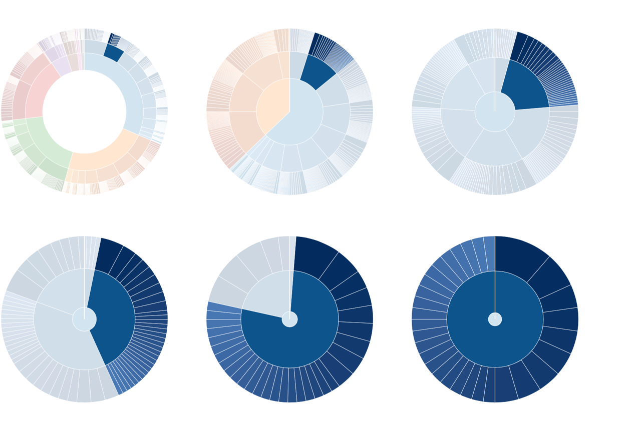
Now that we know when each of these functions is called, we can start to look at what they actually do. A concrete example definitely helps, so let’s consider what happens when the user clicks on the state of Kentucky. As figure shows, it’s on the second row in the upper right section of the visualization.
The data value associated with this SVG <path> will have properties calculated by the partition layout, specifically:
- an
xvalue of 0.051330798479087454 - a
yvalue of 0.5 - a
dxvalue of 0.04182509505703422 - a
dyvalue of 0.25
In terms of our visualization, the area begins at an angular position of 18.479° (x) and continues for another 15.057° (dx). It’s innermost radius begins 177 pixels (y) from the center. When the user clicks on Kentucky, we want the visualization to zoom in on Kentucky and its counties. That’s the region that figure highlights. The angle begins at 18.479° and continues for another 15.057°; the radius begins at 177 pixels and continues to the maxRadius value, a total length of 73 pixels.
The concrete example helps explain the arcTween() implementation. The function first creates three d3.interpolate objects. These objects provide a convenient way to handle the mathematical calculations for interpolations. The first object interpolates from the starting theta domain (initially 0 to 1) to our desired subset (0.051 to 0.093 for Kentucky). The second object does the same for the radius, interpolating from the starting radius domain (initially 0 to 1) to our desired subset (0.5 to 1 for Kentucky and its counties). The final object provides a new, interpolated range for the radius. If the clicked element has a non-zero y value, the new range will start at 20 instead of 0. If the clicked element was the <path> representing the entire U.S., then the range reverts to the initial starting value of 0.
After creating the d3.interpolate objects, arcTween() returns the calculateNewPath function. D3.js calls this function once for each <path> element. When it executes, calculateNewPath() checks to see if the associated <path> element is the root (representing the entire U.S.). If so, calculateNewPath() returns the interpolatePathForRoot function. For the root, no interpolation is necessary, so the desired path is just the regular path that our arc() function (from step 4) creates. For all other elements, however, we use the d3.interpolate objects to redefine the theta and radius scales. Instead of the full 0 to 2π and 0 to maxRadius, we set these scales to be the desired area of focus. Furthermore, we use the amount of progress in the transition from the parameter t to interpolate how close we are to those desired values. With the scales redefined, calling the arc() function returns a path appropriate for the new scales. As the transition progresses, the paths reshape themselves to fit the desired outcome. You can see the intermediate steps in figure .
With this final bit of code, our visualization is complete. Figure shows the results. It adds some additional hover effects in lieu of a true legend; you can find the complete implementation in the book’s source code.
Summing Up
As we’ve seen in these examples, D3.js is a very powerful library for building JavaScript visualizations. Using it effectively requires a deeper understanding of JavaScript techniques than most of the other libraries we’ve seen in this book. If you make the investment to learn D3.js, though, you’ll have more control and flexibility over the results.
Continue reading: Appendix A: Managing Data in the Browser.