Chapter 1: Graphing Data
Many people think of data visualization as intricate interactive graphics of dazzling complexity. Creating effective visualizations, however, doesn’t require Picasso’s artistic skill or Turing’s programming expertise. In fact, when you consider the ultimate purpose of data visualization—helping users understand data—simplicity is one of the most important features of an effective visualization. Simple, straightforward charts are often the easiest to understand. After all, users have seen hundreds or thousands of bar charts, line charts, X/Y plots, and the like. They know the conventions that underlie these charts, so they can interpret a well-designed example effortlessly. If a simple, static chart presents the data best, use it. You’ll spend less effort creating your visualization, and your users will spend less effort trying to understand it.
There are many quality tools and libraries to help you get started with simple visualizations. With these tools, you can avoid reinventing the wheel, and you can be assured of a reasonably attractive presentation by sticking with the library defaults. We’ll look at several of these tools throughout the book, but for this chapter the we’ll use the flotr2 library. flotr2 makes it easy to add standard bar charts, line charts, and pie charts to any web page, and it also supports some less common chart types. We’ll take a look at all of these techniques in the examples that follow. Here’s what you’ll learn:
- How to create a basic bar chart
- How to plot continuous data with a line chart
- How to emphasize fractions with a pie chart
- How to plot X/Y data with a scatter chart
- How to show magnitudes of X/Y data with a bubble chart
- How to display multidimensional data with a radar chart
Creating a Basic Bar Chart
If you’re ever in doubt about what type of chart best explains your data, your first consideration should probably be the basic bar chart. We see bar charts so often that it’s easy to overlook how effective they can be. Bar charts can show the evolution of a value over time, or they can provide a straightforward comparison of multiple values. Let’s walk through the steps to build one.
Step 1: Include the Required JavaScript
Since we’re using the flotr2 library to create the chart, we need to include that library in our web pages. The flotr2 package isn’t currently popular enough for public content distribution networks, so you’ll need to download a copy and host it on your own web server. We’ll use the minimized version (flotr2.min.js) since it provides the best performance.
Flotr2 doesn’t require any other JavaScript libraries (such as jQuery), but it does rely on the HTML canvas feature. Major modern browsers (Safari, Chrome, Firefox) support canvas, but until version 9, Internet Explorer (IE) did not. Unfortunately, there are still millions of users with IE8 (or even earlier). To support those users, we can include an additional library (excanvas.min.js) in our pages. That library is available from Google. Since other browsers don’t need this library, we use some special markup to make sure that only IE8 and earlier will load it. (Line 9.) Start with the following skeleton for your HTML document:
1 2 3 4 5 6 7 8 9 10 11 12 | |
As you can see, we’re including the JavaScript libraries at the end of the document. This approach lets the browser load the document’s entire HTML markup and begin laying out the page while it waits for the server to provide the JavaScript libraries.
Step 2: Set Aside a <div> Element to Hold the Chart
Within our document, we need to create a <div> element to contain the chart. This element must have an explicit height and width, or flotr2 won’t be able to construct the chart. We can indicate the element’s size in a CSS stylesheet, or we can place it directly on the element itself. Here’s how the document might look with the latter approach.
1 2 3 4 5 6 7 8 9 10 11 12 | |
Note that we’ve given the <div> an explicit id (‘chart’) so we can reference it later. You’ll need to use a basic template like this (importing the flotr2 library and setting up the <div>) for all the charts in this chapter.
Step 3: Define the Data
Now we can tackle the data that we want to display. For this example, I’ll use the number of Manchester City wins in the English Premier League for the past seven years. Of course you’ll want to substitute your actual data values, either with inline JavaScript (like the following example) or by another means (such as an AJAX call to the server).
1 2 3 4 5 6 7 | |
As you can see, we have three layers of arrays. Let’s start from the inside and work our way out. For flotr2 charts, each data point is entered in a two-item array with an x-value and y-value. In our case we’re using the year as the x-value and the number of wins as the y-value. We collect all these values in another array called a series. We place this series inside one more outer array. We could enter multiple series into this outer array, but for now we’re showing only one series. Here’s a quick summary of each layer:
- Each data point consists of an x-value and a y-value packaged in an array
- Each series consists of a set of data points packaged in an array
- The data to chart consists of one or more series packaged in an array
Step 4: Draw the Chart
That’s all the setup we need. A simple call to the flotr2 library, as shown here, creates our first attempt at a chart. Here’s the code to do that. We first have to make sure the browser has loaded our document; otherwise the chart <div> might not be present. That’s the point of window.onload. Once that event occurs, we call Flotr.draw with three parameters: the HTML element to contain the chart, the data for the chart, and any chart options (in this case, we specify options only to tell flotr2 to create a bar chart from the data.
1 2 3 4 5 6 7 8 9 10 11 | |
Since flotr2 doesn’t require jQuery, we haven’t taken advantage of any of jQuery’s shortcuts in this example. If your page already includes jQuery, you can use the standard jQuery conventions for the flotr2 charts in this chapter to execute the script after the window has loaded, and to find the <div> container for the chart.
Figure shows what you’ll see on the web page:
Now you have a bar chart, but it’s not showing the information very effectively. Let’s add some options incrementally until we get what we want.
Step 5: Fix the Vertical Axis
The most glaring problem with the vertical axis is its scale. By default, flotr2 automatically calculates the range of the axis from the minimum and maximum values in the data. In our case the minimum value is 11 wins (from 2007), so flotr2 dutifully uses that as its y-axis minimum. In bar charts, however, it’s almost always best to make zero the y-axis minimum. If you don’t use zero, you risk overemphasizing the differences between values and confusing your users. Anyone who glances at the chart above, for example, might think that Manchester City did not win any matches in 2007. That certainly wouldn’t do the team any justice.
Another problem with the vertical axis is the formatting. Flotr2 defaults to a precision of one decimal place, so it adds the superfluous “.0” to all the labels. We can fix both of these problems by specifying some y-axis options. The min property sets the minimum value for the y-axis, and the tickDecimals property tells flotr2 how many decimal places to show for the labels. In our case we don’t want any decimal places.
1 2 3 4 5 6 7 8 9 | |
As you can see in figure , adding these options definitely improves the vertical axis since the values now start at zero and are formatted appropriately for integers.
Step 6: Fix the Horizontal Axis
The horizontal axis needs some work as well. Just as with the y-axis, flotr2 assumes that the x-axis values are real numbers and shows one decimal place in the labels. Since we’re charting years, we could simply set the precision to zero, as we did for the y-axis. But that’s not a very general solution, since it won’t work when the x-values are non-numeric categories (like team names). For the more general case, let’s first change our data to use simple numbers rather than years for the x-values. Then we’ll create an array that maps those simple numbers to arbitrary strings, which we can use as labels.
As you can see, instead of using the actual years for the x-values, we’re simply using 0, 1, 2, and so on. We then define a second array that maps those integer values into strings. Although our strings are years (and thus numbers) they could be anything.
1 2 3 4 5 6 7 8 9 10 | |
Another problem is a lack of spacing between the bars. By default, flotr2 has each bar take up its full horizontal space, but that makes the chart look very cramped. We can adjust that with the barWidth property. Let’s set it to 0.5 so that each bar takes up only half the available space.
Here’s how we pass those options to flotr2. Note in line 11 that we use the ticks property of the x-axis to tell flotr2 which labels match which x-values.
1 2 3 4 5 6 7 8 9 10 11 12 13 | |
Now we’re starting to get somewhere with our chart, as shown in figure . The x-axis labels are appropriate for years, and there is space between the bars to improve the chart’s legibility.
Step 7: Adjust the Styling
Now that the chart is functional and readable, we can pay some attention to the aesthetics. Let’s add a title, get rid of the unnecessary grid lines, and adjust the coloring of the bars.
1 2 3 4 5 6 7 8 9 10 11 12 13 14 15 16 17 18 19 20 21 22 | |
As you can see in figure , we now have a bar chart that Manchester City fans can be proud of.
For any data set of moderate size, the standard bar chart is often the most effective visualization. Users are already familiar with its conventions, so they don’t have to spend any extra effort to understand the format. The bars themselves offer a clear visual contrast with the background, and they use a single linear dimension (height) to show differences between values, so users easily grasp the salient data.
Step 8: Vary the Bar Color
So far our chart has been fairly monochromatic. That actually makes sense because we’re showing the same value (Manchester City wins) across time. But bar charts are also good for comparing different values. Suppose, for example, we wanted to show the total wins for multiple teams in one year. In that case, it makes sense to use a different color for the bar of each team’s bar. Let’s of over how we can do that.
First we need to restructure the data somewhat. Previously we’ve shown only a single series. Now we want a different series for each team. Creating multiple series lets flotr2 color each independently. The following example shows how the new data series compares with the old. We’ve left the wins array in the code for comparison, but it’s the wins2 array that we’re going to show now. Notice how the nesting of the arrays changes. Also, we’re going to label each bar with the team abbreviation instead of the year.
1 2 3 4 5 6 7 8 9 | |
With those changes, our data is structured appropriately, and we can ask flotr2 to draw the chart. When we do that, let’s use different colors for each team. Everything else is the same as before.
1 2 3 4 5 6 7 8 9 10 11 12 13 14 15 16 17 18 19 20 21 22 | |
As you can see in figure , with a few minor adjustments we’ve completely changed the focus of our bar chart. Instead of showing a single team at different points in time, we’re now comparing different teams at the same point in time. That’s the versatility of a simple bar chart.
We’ve used a lot of different code fragments to put together these examples. If you want to see a complete example in a single file, check out this book’s source code.
Step 9: Work Around Flotr2 “Bugs”
If you’re building large web pages with a lot of content, you may run into a flotr2 “bug” that can be quite annoying. I’ve put “bug” in quotation marks because the flotr2 behavior is deliberate, but I believe it’s not correct. In the process of constructing its charts, flotr2 creates dummy HTML elements so it can calculate their sizes. Flotr2 doesn’t intend these dummy elements to be visible on the page, so it hides them by positioning them off the screen. Unfortunately, what flotr2 thinks is off the screen isn’t always. Specifically, around line 2280 in flotr2.js you’ll find the statement:
D.setStyles(div, { 'position' : 'absolute', 'top' : '-10000px' });Flotr2 intends to place these dummy elements 10,000 pixels above the top of the browser window. However, CSS absolute positioning can be relative to the containing element, which is not always the browser window. So if your document is more than 10,000 pixels high, you may find flotr2 scattering text in random-looking locations throughout the page. There are a couple of ways to work around this bug, at least until the flotr2 code is revised.
One option is to modify the code yourself. Flotr2 is open source, so you can freely download the full source code and modify it appropriately. One simple modification would position the dummy elements far to the right or left rather than above. Instead of 'top' you could change the code to 'right'. If you’re not comfortable making changes to the library’s source code, another option is to find and hide those dummy elements yourself. You should do this after you’ve called Flotr.draw() for the last time. The latest version of jQuery can banish these extraneous elements with the following statement:
1 | |
Plotting Continuous Data with a Line Chart
Bar charts work great for visualizing a modest amount of data, but for more significant amounts of data, a line chart can present the information much more effectively. Line charts are especially good at revealing overall trends in data without bogging the user down in individual data points.
For our example, we’ll look at two measures that may be related to each other: carbon dioxide (CO2) concentration in the atmosphere and global temperatures. We want to show how both measures have changed over time, and we’d like to see how strongly related the values are. A line chart is a perfect visualization tool for looking at these trends.
Just like for the bar chart, you’ll need to include the flotr2 library in your web page and create a <div> element to contain the chart. Let’s start prepping the data.
Step 1: Define the Data
We’ll begin with CO2 concentration measurements. The US National Oceanographic and Atmospheric Administration (NOAA) publishes measurements taken at Mauna Loa, Hawaii from 1959 through today. The first few values are shown in the following excerpt.
1 2 3 4 5 6 | |
NOAA also publishes measurements of mean global surface temperature. These values measure the difference from the baseline, which is currently taken to be the average temperature over the entire 20th century. Since the CO2 measurements begin in 1959, we’ll use that as our starting point for temperature as well.
1 2 3 4 5 6 | |
Step 2: Graph the CO2 Data
Graphing one data set is quite easy with flotr2. We simply call the draw() method of the Flotr object. The only parameters the method requires are a reference to the HTML element in which to place the graph, and the data itself. As part of the data object, we indicate that we want a line chart.
1 2 3 4 | |
Since flotr2 does not require jQuery, we’re not using any jQuery convenience functions in our example. If you do have jQuery on your pages, you can simplify the preceding code a little. In either case figure shows the result:
The chart clearly shows the trend in CO2 concentration for the past 50+ years.
Step 3: Add the Temperature Data
With a simple addition to our code, we can include temperature measurements in our chart. Note that we include the yaxis option for the temperature data and give it a value of 2. That tells flotr2 to use a different y-scale for the temperature data.
1 2 3 4 5 6 7 | |
The chart in figure now shows both measurements for the years in question, but it’s gotten a little cramped and confusing. The values butt up against the edges of the chart, and the grid lines are hard for users to interpret when there are multiple vertical axes.
Step 4: Improve the Chart’s Readability
By using more flotr2 options, we can make several improvements in our line chart’s readability. First we can eliminate the grid lines, since they aren’t relevant for the temperature measurements.
We can also extend the range of both vertical axes to provide a bit of breathing room for the chart. Both of these changes are additional options to the draw() method. The grid options turn off the gridlines by setting both the horizontalLines and verticalLines properties to false. The yaxis options specify the minimum and maximum value for the first vertical axis (CO2 concentration), while the y2axis options specify those values for the second vertical axis (temperature difference).
1 2 3 4 5 6 7 8 9 10 11 | |
The resulting graph in figure is cleaner and easier to read.
Step 5: Clarify the Temperature Measurements
The temperature measurements might still be confusing to users, since they’re not really temperatures; they’re actually deviations from the 20th century average. Let’s convey that distinction by adding a line for that 20th century average, and explicitly labelling it. The simplest way to do that is to create a “dummy” data set and add that to the chart. The extra data set has nothing but zeros.
1 2 | |
When we add that data set to the chart, we need to indicate that it corresponds to the second y-axis. And since we want this line to appear as part of the chart framework rather than as another data set, let’s deemphasize it somewhat by setting its width to one pixel, coloring it dark gray, and disabling shadows.
1 2 3 4 5 6 7 8 9 10 11 12 13 | |
As you can see, we’ve placed the zero line first among the data sets. With that order, flotr2 will draw the actual data on top of the zero line, as shown in figure , reinforcing its role as chart framework instead of data.
Step 6: Label the Chart
For the last step in this example, we’ll add appropriate labels to the chart. That includes an overall title, as well as labels for individual data sets. And to make it clear which axis refers to temperature, we’ll add a “°C” suffix to the temperature scale. We identify the label for each data series in the label option for that series. The overall chart title merits its own option, and we add the “°C” suffix using a tickFormatter function. That option expects a function. For each value on the axis, the formatter function is called with the value, and flotr2 expects it to return a string to use for the label. As you can see in line 26, we simply append the " °C" string to the value.
1 2 3 4 5 6 7 8 9 10 11 12 13 14 15 16 17 18 19 20 21 22 23 24 25 26 27 28 29 | |
Notice that we’ve also swapped the position of the CO2 and temperature graphs. We’re now passing the temperature data series ahead of the CO2 series. We did that so that the two temperature quantities (baseline and difference) appear next to each other in the legend, making their connection a little more clear to the user. And because the temperature now appears first in the legend, we’ve also swapped the axes, so the temperature axis is on the left. Finally, we’ve adjusted the title of the chart for the same reason. Figure shows the result.
A line chart like excels in visualizing this kind of data. Each data set contains over 50 points, making it impractical to present each individual point. And, in fact, individual data points are not the focus of the visualization. Rather, we want to show trends—the trends of each data set as well as their correlation. Connecting the points with lines leads the user right to those trends and to the heart of our visualization.
Emphasizing Fractions Using a Pie Chart
Pie charts don’t get a lot of love in the visualization community, and for a pretty good reason: they’re rarely the most effective way to communicate data. We will walk through the steps to create pie charts in this section, but first let’s take some time to understand the problems they introduce. Figure , for example, shows a simple pie chart. Can you tell from the chart which color is the largest? The smallest?
It’s very hard to tell. That’s because humans are not particularly good at judging the relative size of areas, especially if those areas aren’t rectangles. If we really wanted to compare these five values, a bar chart works much better. Figure shows the same values in a bar chart:
Now, of course, it’s easy to rank each color. With a bar chart we only have to compare one dimension—height. This yields a simple rule of thumb: if you’re comparing different values against one another, consider a bar chart first. It will almost always provide the best visualization.
One case, however, where pie charts can be quite effective is when we want to compare a single partial value against a whole. Say, for example, we want to visualize the percentage of the world’s population that lives in poverty. In that case a pie chart may work quite well. Here’s how we can construct such a chart using flotr2.
Just as in this chapter’s first example, we need to include the flotr2 library in our web page and set aside a <div> element to contain the chart we’ll construct. The unique aspects of this example begin below.
Step 1: Define the Data
The data in this case is quite straightforward. According to the World Bank, at the end of 2008, 22.4 percent of the world’s population lived on less than $1.25/day. That’s the fraction that we want to emphasize with our chart.
1 | |
Here we have an array with two data series: one for the percentage of the population in poverty (22.4) and a second series for the rest (77.6). Each series itself consists of an array of points. In this example, and for pie charts in general, there is only one point in each series, with an x-value and a y-value (which are each stored together in yet another, inner array). For pie charts the x-values are irrelevant, so we simply include the placeholder values 0 and 1.
Step 2: Draw the Chart
To draw the chart, we call the draw() method of the Flotr object. That method takes three parameters: the element in our HTML document in which to place the chart, the data for our chart, and any options. We’ll start with the minimum set of options required for a pie chart. As you can see, flotr2 requires a few more options for a minimum pie chart than it does for other common chart types. For both the x- and y-axes we need to disable labels, which we do by setting the showLabels property to false in lines 7 and 10. We also have to turn off the grid lines, as a grid doesn’t make a lot of sense for a pie chart. We accomplish that by setting the verticalLines and horizontalLines properties of the grid option to false in lines 13 and 14.
1 2 3 4 5 6 7 8 9 10 11 12 13 14 15 16 17 | |
Since flotr2 doesn’t require jQuery, we’re not using any of the jQuery convenience functions in this example. If you do have jQuery for your pages, you can simplify this code a bit.
Figure is a start, but it’s hard to tell exactly what the graph intends to show.
Step 3: Label the Values
The next step is to add some text labels and a legend to indicate what the chart is displaying. To label each quantity separately, we have to change the structure of our data. Instead of using an array of series, we’ll create an object to store each series. Each object’s data property will contain the corresponding series, and we’ll add a label property for the text labels.
1 2 3 4 | |
With our data structured this way, flotr2 will automatically identify labels associated with each series. Now when we call the draw() method, we just need to add a title option. Flotr2 will add the title above the graph, and create a simple legend identifying the pie portions with our labels. To make the chart a little more engaging, we’ll pose a question in our title. That’s why we’re labeling only one of the areas in the chart: the labeled area answers the question in the title.
1 2 3 4 5 6 7 8 9 10 11 12 13 14 15 16 | |
The chart in figure reveals the data quite clearly.
Although pie charts have a bad reputation in the data visualization community, there are some applications for which they are quite effective. They’re not very good at letting users compare multiple values, but as shown in this example, they do provide a nice and easily understandable picture showing the proportion of a single value within a whole.
Plotting X/Y Data with a Scatter Chart
A bar chart is often most effective for visualizing data that consists primarily of a single quantity (such as the number of wins in the bar charts we created earlier). But if we want to analyze data that primarily consists of a single quantity, perhaps a quantity that changes at regular intervals (e.g. yearly) or varies among a population (e.g. sports teams), the bar chart is often the best tool for our visualization. The real world, however, sometimes makes things more complicated than a single quantity can capture. If we want to explore the relationship between two different quantities, a scatter chart can be more effective. Suppose, for example, we wish to visualize the relationship between a country’s health-care spending (one quantity) and its life expectancy (the second quantity). Let’s step through an example to see how to create a scatter chart for that data.
Just as in this chapter’s first example, we need to include the flotr2 library in our web page and set aside a <div> element to contain the chart we’ll construct.
Step 1: Define the Data
For this example, we’ll use the 2012 Report from the Organisation for Economic Co-operation and Development (OECD). This report includes health-care spending as a percent of gross domestic product, and average life expectancy at birth. (Although the report was released in late 2012, it contains data for 2010.) Here you can see a short excerpt of that data stored in a JavaScript array:
1 2 3 4 5 | |
Step 2: Format the Data
As is often the case, we’ll need to restructure the original data a bit so that it matches the format flotr2 requires. The JavaScript code for that is shown next. We start with an empty data array and step through the source data. For each element in the source health_data, we extract the data point for our chart and push that data point into the data array.
1 2 3 4 5 6 7 | |
Since flotr2 doesn’t require jQuery, we’re not using any of the jQuery convenience functions in this example. But if you’re using jQuery for other reasons in your page, you could, for example, use the .map() function to simplify the code for this restructuring. (Chapter 2 includes a detailed example of the jQuery .map() function.)
Step 3: Plot the Data
Now all we need to do is call the draw() method of the Flotr object to create our chart. For a first attempt, we’ll stick with the default options.
1 2 3 4 | |
As you can see, flotr2 expects at least two parameters. The first is the element in our HTML document in which we want the chart placed, and the second is the data for the chart. The data takes the form of an array. In general, flotr2 can draw multiple series on the same chart, so that array might have multiple objects. In our case, however, we’re charting only one series, so the array has a single object. That object identifies the data itself, and it tells flotr2 to show points instead of lines.
Figure shows our result. Notice how the points are pressed right up against the edges of the chart.
Step 4: Adjust the Chart’s Axes
The first attempt isn’t too bad, but flotr2 automatically calculates the ranges for each axis, and its default algorithm usually results in a chart that’s too cramped. Flotr2 does have an autoscale option; if you set it, the library attempts to find sensible ranges for the associated axes automatically. Unfortunately, in my experience the ranges flotr2 suggests rarely improve the default option significantly, so in most cases we’re better off explicitly setting them. Here’s how we might do that for our chart:
1 2 3 4 5 6 7 8 9 10 11 | |
We’ve added a third parameter to the draw() method that contains our options which in this case are properties for the x- and y-axes. In each case we’re explicitly setting a minimum and maximum value. By specifying ranges that give the data a little breathing room, we’ve made the chart in figure much easier to read.
Step 5: Label the Data
Our chart so far looks reasonably nice, but it doesn’t tell users what they’re seeing. We need to add some labels to identify the data. A few more options can clarify the chart:
1 2 3 4 5 6 7 8 9 10 11 12 13 | |
The title and subtitle options give the chart its overall title and subtitle, while the title properties within the xaxis and yaxis options name the labels for those axes. In addition to adding labels, we’ve told flotr2 to drop the unnecessary decimal point from the x- and y-axis values by changing the tickDecimals property in lines 9 and 11. The chart in figure looks much better.
Step 6: Clarify the X-Axis
Although our chart has definitely improved since our first attempt, there is still one nagging problem with the data presentation. The x-axis represents a percentage, but the labels for that axis show whole numbers. That discrepancy might cause our users some initial confusion, so lets get rid of it. Flotr2 allows us to format the axis labels however we want. In this example, we simply wish to add a percentage symbol to the value. That’s easy enough:
1 2 3 4 5 6 7 8 9 10 11 12 13 14 | |
The trick is the tickFormatter property of the xaxis options. It’s line 11 in the preceding code. That property specifies a function. When tickFormatter is present, flotr2 doesn’t draw the labels automatically. Instead, at each point where it would draw a label, it calls our function. The parameter passed to the function is the numeric value for the label. Flotr2 expects the function to return a string that it will use as the label. In our case we’re simply adding a percent sign after the value.
In figure , with the addition of the percentage values labeling the horizontal axis, we have a chart that presents the data clearly.
The scatter plot excels at revealing relationships between two different variables. In this example, we can see how life expectancy relates to health-care spending. In aggregate, more spending yields longer life.
Step 7: Answer Users’ Questions
Now that our chart successfully presents the data, we can start to look more carefully at the visualization from our users’ perspective. We especially want to anticipate any questions that users might have and try to answer them directly on the chart. There are at least three questions that stand out:
- What countries are shown?
- Are there any regional differences?
- What’s that data point way over on the right?
One way to answer those questions would be to add mouseovers (or tool tips) to each data point. But we’re not going to use that approach in this example for a couple of reasons. First (and most obviously), interactive visualizations are the subject of chapter 2; this chapter considers only static charts and graphs. Secondly, mouse overs and tool tips are ineffective for users accessing our site on a touch device such as a smartphone or tablet. If we required users to have a mouse to fully understand our visualization, we might be neglecting a significant (and rapidly growing) number of them.
Our approach to this problem will be to divide our data into multiple series so that we can color and label each independently. Here’s the first step in breaking the data into regions:
1 2 3 4 5 6 7 8 9 10 11 12 13 14 | |
Here, we’re giving the United States its own series, separate from the Americas series. That’s because the U.S. is the outlier data point on the far right of the chart. Our users probably want to know the specific country for that point, not just its region. For the other countries, a region alone is probably enough identification. As before, we need to restructure these arrays into flotr2’s format. The code is the same as step 4; we’re just repeating it for each data set.
1 2 3 4 5 6 7 8 | |
Once we’ve separated the countries, we can pass their data to flotr2 as distinct series. Here we see why flotr2 expects arrays as its data parameter. Each series is a separate object in the array.
1 2 3 4 5 6 7 8 9 10 11 12 13 14 15 16 17 18 | |
With the countries in different data series based on regions, flotr2 now colors the regions distinctly as shown in figure .
For the final enhancement, we add a legend to the chart identifying the regions. In order to make room for the legend, we can increase the range of the x-axis (line 13) and position the legend in the northeast quadrant (line 17).
1 2 3 4 5 6 7 8 9 10 11 12 13 14 15 16 17 18 19 | |
This addition gives us the final chart shown in figure .
Adding Magnitudes to X/Y Data with a Bubble Chart
Traditional scatter plots, like those described in the previous example, show the relationship between two values: the x-axis and the y-axis. Sometimes, however, two values are not adequate for the data we want to visualize. If we need to visualize three variables, we could use a scatter plot framework for two of the variables and then vary the size of the points according to the third variable. The resulting chart is a bubble chart.
Using bubble charts effectively requires some caution, though. As we saw earlier with pie charts, humans are not very good at accurately judging the relative areas of nonrectangular shapes, so bubble charts don’t lend themselves to precise comparisons of the bubble size. But if your third variable conveys only the general sense of a quantity rather than an accurate measurement, a bubble chart may be appropriate.
For this example we’ll use a bubble chart to visualize the path of Hurricane Katrina in 2005. Our x- and y-values will represent position (latitude and longitude), and we’ll ensure our users can interpret those values very accurately. For the third value—the bubble area—we’ll use the storm’s sustained wind speed. Since wind speed is only a general value anyway (as the wind gusts and subsides), a general impression is sufficient.
Just as in this chapter’s first example, we need to include the flotr2 library in our web page and set aside a <div> element to contain the chart we’ll construct.
Step 1: Define the Data
We’ll start our example with data taken from Hurricane Katrina observations. The data includes the latitude and longitude of the observation and the sustained wind speed in miles/hour.
1 2 3 4 5 | |
For the bubble chart, flotr2 needs each data point to be an array rather than an object, so lets build a simple function to convert the source data into that format. To make the function more general, we can use an optional parameter to specify a filter function. And while we’re extracting data points, we can reverse the sign of the longitude so that west to east displays left to right.
The code for our function starts by setting the return value (result) to an empty array in line 2. Then it iterates through the input source_array one element at a time. If the filter_function parameter is available, and if it is a valid function, our code calls that function with the source array element as a parameter. If the function returns true, or if no function was passed in the parameter, then our code extracts the data point from the source element and pushes it onto the result array.
1 2 3 4 5 6 7 8 9 10 11 12 13 14 15 | |
As you can see, the filter_function parameter is optional. If the caller omits it (or if it is not a valid function), then every point in the source ends up in the result. We won’t use the filter function right away, but it will come in handy for the later steps in this example.
Step 2: Create a Background for the Chart
Because the x- and y-values of our chart will represent position, a map makes the perfect chart background. To avoid any copyright concerns, we’ll use map images from Stamen Design that use data from OpenStreetMap. Both are available under Creative Commons licenses, CC BY 3.0 and CC BY SA, respectively.
Figure shows the map image on which we’ll overlay the hurricane’s path.
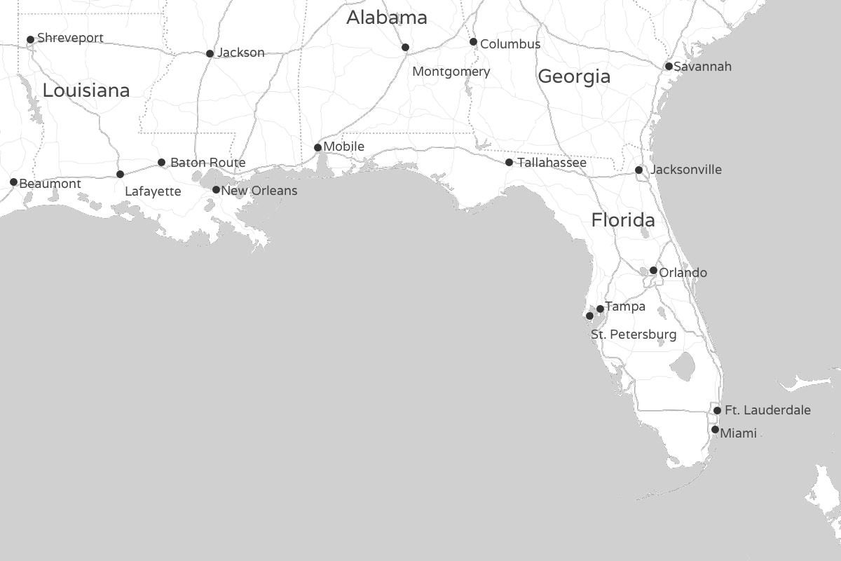
Projections can be a tricky issue when you’re working with maps, but for smaller mapped area they have less of an effect. Also, they’re less critical in the center of the mapped region. For this example, with its relatively small area and action focused in the center, we’ll assume the map image uses a Mercator projection. That assumption lets us avoid any advanced mathematical transformations when converting from latitude and longitude to x- and y-values.
Step 3: Plot the Data
It will take us several iterations to get the plot looking the way we want, but let’s start with the minimum number of options. One parameter we will need to specify is the bubble radius. For static charts such as this example, it’s easiest to experiment with a few values to find the best size. A value of 0.3 seems effective for our chart. In addition to the options, the draw() method expects an HTML element that will contain the chart, as well as the data itself. As you can see, we’re using our transformation function to extract the data from our source. The return value from that function serves directly as the second parameter to draw().
1 2 3 4 5 6 7 | |
For now, we haven’t bothered with the background image. We’ll add that to the chart once we’ve adjusted the data a bit. The result in figure still needs improvement, but it’s a working start.
Step 4: Add the Background
Now that we’ve seen how flotr2 will plot our data, we can add in the background image. We’ll want to make a few other additions at the same time. First, as long as we’re adding the background, we can remove the grid lines. Second, let’s disable the axis labels; latitude and longitude values don’t have much meaning for the average user, and they’re certainly not necessary with the map. Finally, and most importantly, we need to adjust the scale of the chart to match the map image.
Our image shows latitude values from 23.607°N to 33.657°N and longitude from 77.586°W to 94.298°W. We provide those values to flotr2 as the ranges for its axes in line 11. The grid options in lines 5 through 9 tell flotr2 to omit both horizontal and vertical grid lines, and they designate the background image. The xaxis and yaxis options in lines 10 and 11 disable labels for both axes and specify their minimum and maximum values. Note that because we’re dealing with longitudes west of 0, we’re using negative values.
1 2 3 4 5 6 7 8 9 10 11 12 13 14 15 16 | |
At this point the chart in figure is looking pretty good. We can clearly see the path of the hurricane and get a sense of how the storm strengthened and weakened along that path.
Step 5: Color the Bubbles
This example gives us a chance to provide even more information to our users without overly distracting them, we have the option to modify the bubble colors. Let’s use that freedom to indicate the Saffir-Simpson classification for the storm at each measurement point.
Here’s where we can take advantage of the filter option we included in the data formatting function. The Saffir-Simpson classification is based on wind speed, so we’ll filter based on the wind property. For example, here’s how to extract only those values that represent a Category 1 hurricane, with wind speeds from 74 to 95 miles per hour. The function we pass to get_points only returns true only for appropriate wind speeds.
1 2 3 | |
To have flotr2 assign different colors to different strengths, we divide the data into multiple series with the following code. Each series gets its own color. In addition to the five hurricane categories, we’ve also parsed out the points for tropical storm and tropical depression strength.
1 2 3 4 5 6 7 8 9 10 11 12 13 14 15 16 17 18 19 20 21 22 23 24 25 26 27 28 29 30 | |
We’ve also added labels for the hurricane categories and placed a legend in the lower left of the chart, as you can see in figure .
Step 6: Adjust the Legend Styles
By default, flotr2 seems to prefer all elements as large as possible. The legend in figure is a good example: it looks cramped and unattractive. Fortunately, the fix is rather simple: we simply add some CSS styles which give the legend padding. We can also set the legend’s background color explicitly rather than relying on flotr2’s manipulation of opacity.
1 2 3 4 | |
To prevent flotr2 from creating its own background for the legend, set the opacity to zero.
1 2 3 4 5 | |
With that final tweak, we have the finished product of figure . We don’t want to use the flotr2 options to specify a title because flotr2 will shrink the chart area by an unpredictable amount (since we cannot predict the font sizing in the users’ browsers). That would distort our latitude transformation. Of course, it’s easy enough to use HTML to provide the title.
The bubble chart adds another dimension to the two-dimensional scatter chart. In fact, as in our example, it can add two additional dimensions. The example uses bubble size to represent wind speed and color to indicate the hurricane’s classification. Both of these additional values require care, however. Humans are not good at comparing two-dimensional areas, nor can they easily compare relative shades or colors. We should never use the extra bubble chart dimensions to convey critical data or precise quantities, therefore. Rather, they work best in examples such as this example—neither the exact wind speed nor the specific classification need be as precise as the location. Few people can tell the difference between 100 and 110 mile-per-hour winds, but they certainly know the difference between New Orleans and Dallas.
Displaying Multidimensional Data with a Radar Chart
If you have data with many dimensions, a radar chart may be the most effective way to visualize it. Radar charts are not as common as other charts, though, and their unfamiliarity makes them a little harder for users to interpret. If you design a radar chart, be careful not to increase that burden.
Radar charts are most effective when your data has several characteristics
- You don’t have too many data points to show. Half a dozen data points is about the maximum that a radar chart can accommodate.
- The data points have multiple dimensions. With two or even three dimensions to your data, you would probably be better off with a more traditional chart type. Radar charts come into play with data of four or more dimensions.
- Each data dimension is a scale that can at least be ranked (from good to bad, say), if not assigned a number outright. . Radar charts don’t work well with data dimensions that are merely arbitrary categories (such as political party or nationality). They work best if all the dimensions can at least be ranked, if not assigned a number outright.
A classic use for radar charts is analyzing the performance of players on a sports team. Consider, for example, the starting lineup of the 2012 National Basketball Association’s (NBA) Miami Heat. There are only five data points (the five players). There are multiple dimensions—points, assists, rebounds, blocks, steals, and so on, and each of those dimensions has a natural numeric value.
Here are the players’ 2011–2012 season averages per game, as well as the team totals (which include the contributions of nonstarters).
| Player | Points | Rebounds | Assists | Steals | Blocks |
|---|---|---|---|---|---|
| Chris Bosh | 17.2 | 7.9 | 1.6 | 0.8 | 0.8 |
| Shane Battier | 5.4 | 2.6 | 1.2 | 1.0 | 0.5 |
| LeBron James | 28.0 | 8.4 | 6.1 | 1.9 | 0.8 |
| Dwayne Wade | 22.3 | 5.0 | 4.5 | 1.7 | 1.3 |
| Mario Chalmers | 10.2 | 2.9 | 3.6 | 1.4 | 0.2 |
| Team Total | 98.2 | 41.3 | 19.3 | 8.5 | 5.3 |
Just as in this chapter’s first example, we need to include the flotr2 library in our web page and set aside a <div> element to contain the chart we’ll construct.
Step 1: Define the Data
We’ll start with a typical JavaScript expression of the team’s statistics. For our example we’ll start with an array of objects corresponding to each starter, and a separate object for the entire team.
1 2 3 4 5 6 7 8 9 10 11 12 13 14 15 16 17 18 19 | |
For an effective radar plot, we need to normalize all the values to a common scale. In this example, let’s translate raw statistics into team percentage. For example, instead of visualizing LeBron’s James’ scoring as 28.0, we’ll show it as 29 percent (28.0/98.2).
There are a couple of functions we can use to convert the raw statistics into an object to chart. The first function returns the statistics object for a single player. It simply searches through the players array looking for that player’s name. The second function steps through each statistic in the team object, gets the corresponding statistic for the named player, and normalizes the value. The returned object will have a label property equal to the player’s name, and an array of normalized statistics for that player.
1 2 3 4 5 6 7 8 9 10 11 12 13 14 15 | |
For example, the function call player_data("LeBron James") returns the following object:
1 2 3 4 5 6 7 8 9 10 | |
For the specific statistics, we’re using counter from 0 to 4. We’ll see how to map those numbers into meaningful values shortly.
Since flotr2 doesn’t require jQuery, we aren’t taking advantage of any jQuery convenience function in the preceding code. We’re also not taking full advantage of the JavaScript standard (including methods such as .each()) because Internet Explorer (IE) releases prior to version 9 do not support those methods. If you have jQuery on your pages for other reasons, or if you don’t need to support older IE versions, you can simplify this code quite a bit.
The last bit of code we’ll use is a simple array of labels for the statistics in our chart. The order must match the order returned in player_data().
1 2 3 4 5 6 7 | |
Step 2: Create the Chart
A single call to flotr2’s draw() method is all it takes to create our chart. We need to specify the HTML element in which to place the chart, as well as the chart data. For the data, we’ll use the get_player() function previously. The following code also includes a few options. The title option in line 9 provides an overall title for the chart, and the radar option in line 10 tells flotr2 the type of chart we want. With a radar chart we also have to explicitly specify a circular (as opposed to rectangular) grid, so we do that with the grid option in line 11. The final two options detail the x- and y-axes. For the x-axis we’ll use our labels array to give each statistic a name, and for the y-axis we’ll forgo labels altogether and explicitly specify the minimum and maximum values.
1 2 3 4 5 6 7 8 9 10 11 12 13 14 15 | |
The only real trick is making the HTML container wide enough to hold both the chart proper and the legend since flotr2 doesn’t do a great job of calculating the size appropriately. For a static chart such as this one, trial and error is the simplest approach and gives us the chart shown in figure .
Although it’s certainly not a surprise to NBA fans, the chart clearly demonstrates the value of LeBron James to the team. He leads the team in four of the five major statistical categories.
The radar chart lends itself only to a few specialized applications, but it can be effective when there is only a modest number of variables, each of which is easily quantified, it can be effective. In figure , each player’s area on the chart roughly corresponds to his total contribution across all of the variables. The relative size of the red area makes James’s total contribution strikingly clear.
Summing Up
The examples in this chapter provide a quick tour of the many types of standard data charts, the simplest and most straightforward tool for visualizing data. Each of these charts is especially effective for certain types of visualizations.
- Bar Charts
- The workhorse of charts. Effective at showing the change of a quantity over a small number of regular time intervals, or at comparing several different quantities against each other.
- Line Charts
- More effective than bar charts when there is a large number of data values to show, or for showing quantities that vary on an irregular schedule.
- Pie Charts
- Often overused but can be effective to highlight the proportion of a single value within a whole.
- Scatter Charts
- Effective for showing possible relationships between two values.
- Bubble Charts
- Adds a third value to scatter charts, but should be used carefully, as humans have difficulty accurately assessing the relative areas of circular regions.
- Radar Charts
- Designed to show several aspects of the subject on one chart. Not as familiar to many users, but can be effective for certain specialized cases.
Continue reading: Chapter 2: Making Charts Interactive.